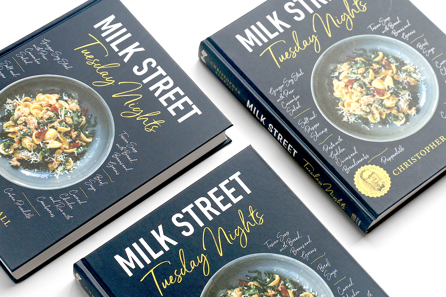
Milk Street: Tuesday Nights is second cookbook from Christopher Kimball’s Milk Street cooking school and public television show. Named after the popular column in the Milk Street’s magazine, it contains recipes that are quicker and less involving to make after a long day at work. The recipes teach a simpler, bolder, healthier way to cook, grouped by chapter with titles such as ‘fast,’ ‘faster,’ ‘fastest,’ with emphasis on speed.
2019 James Beard Cookbook Award Winner!
We Return Fighting for the Smithsonian National Museum of African American History and Culture, (NMAAHC), documents the role of African American soldiers in WWI, it ties into an exhibition at the Museum. The book features historical photos and artifacts that illustrate essays by prominent historians.
The book uses contemporary clean typography, incorporating illustrations, photos and artifacts from the exhibition and Museum’s collection. There is a gatefold timeline that hilights key events in the African American military history and the fight for civil-rights from 1864 through 1964.
The cover features an image of the Harlem Hellfighters, as they return home from WWI, overlaid with bold typography. A spot UV was used to high-light the title over a matte lamination.
The book was well received by the curators and the Smithsonian Director Lonnie Bunch.
Volta Talent Strategies, is the rebranded name for SJL Attorney Search, an executive consulting, coaching, recruitment firm. The brief was that the logo should feel modern, clean, tech-friendly and accessible. The word ‘volta’ means a turning point, a pivot, was a perfect analogy for their services, this was also accompanied with the tag-line “Change is the only constant.”
The ‘O’ of the logotype is a stylized compass point set to a few degrees off north, encouraging clients to chart their own course. Collateral created includes, trade show booth, website, event graphics and a introductory video.
The Sweet Home Cafe is the restaurant at the Smithsonian National Museum of African American History and Culture (NMAAHC), it celebrates African American cuisine and cooking. The book includes recipes from the restaurant, along with traditional recipes from around the country. Sidebars are interspersed throughout the book, high-lighting ingredients, historic photographs and artifacts from the museums’ collection. It’s a guided tour through African American culinary history and its lasting influence on food today.
Nominated for a 2019 James Beard Cookbook Award
Art direction and design for Smithsonian Books.
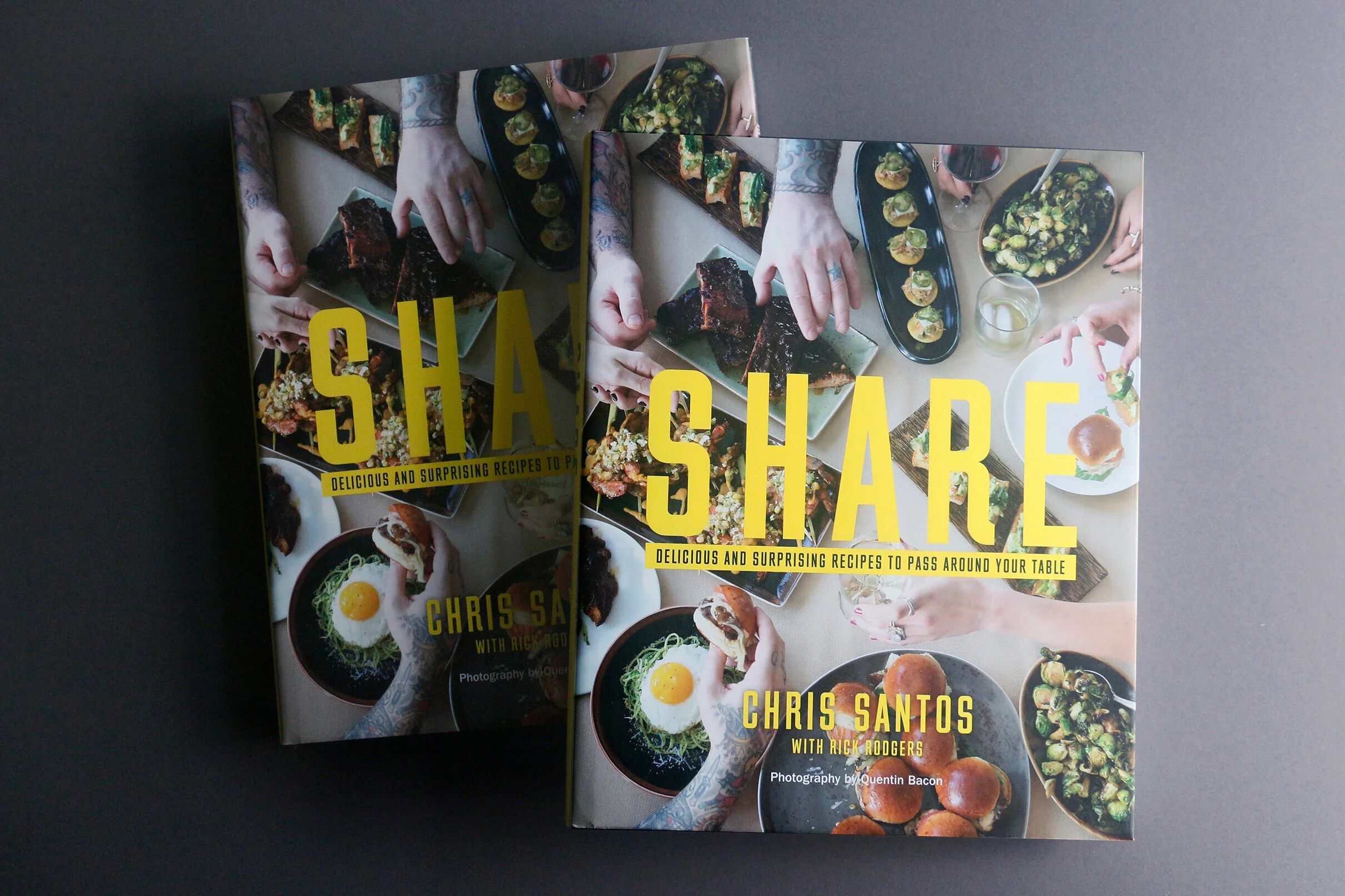
Chris Santos, is a chef and regular judge on Food Network’s Chopped, is also owner of restaurants Beauty and Essex, and The Stanton Social. His signature dishes are small plates meant for sharing, hence the title Share. The visual direction and design of the book builds on the mood of his restaurants which are dimly lit, intimate, luxurious places, and his signature tattoos and heavy metal persona. The images were styled to be moody and the typographic style is bold and direct.
Art Direction and editorial design
The redesigned Vassar magazine aims to be both engaging and worthy of its alumni. The redesign strikes a balance between tradition and contemporary. The masthead was changed from Vassar Quarterly to VQ for a more modern edgy look. The content was reorganized into four distinct sections, Vassar Today, Beyond Vassar, Features and Class Notes. The new layout also called for shorter more accessible pieces and infographics, as well as leaving room for longer more in-depth stories, with more compelling photography and illustration throughout. The paper was also changed to have a better printing surface and a tactile feeling and as a plus it’s also FSC certified.
The refreshed brand identity and web site for Janko Rasic Architects, an architectural firm based in Manhattan, reflects their subtle modernism, and re-positions the 50 year old company firmly in the 21st century. JRA’s work is well-crafted with a clean sensibility, with a focus on office, retail and residential spaces.
The logo mark created is a letterform that when inverted reads both as a j and r. That sits next to typographic lock-up of the name, visual weight was added to Janko Rasic to set it apart from Architects. The supporting the visual identity uses shades of grey to compliment the logo, for print collateral we created business cards, presentation covers and brochures. The web site is a customized WordPress theme, where the projects are grouped under larger themes such as Live, Work, Play etc. This is reflected on the home page with a slideshow of large images with large theme words over laid.
Hue is the alumni magazine for the Fashion Institute of Technology. After seven years and twenty-one issues, we felt it was time for a redesign. Working with the editorial team, we reviewed past issues and discussed the successes and short comings.
The team evaluated how stories could work on the page, both visually and editorially. This evaluation process now starts off each issue. Font and color choices were rationalized, the news and departments were made to look more cohesive.
The result a cleaner looking, visually stunning magazine, that showcases the alumni that have gone onto play a important roles in both design and business worlds in the fashion industries.